Today I’m sharing with you guys a project that I’m working on. My client is a New Orleans woman recently married and moved into her family home. Her home has gone through plenty renovations since Hurricane Katrina and now she’s ready to get all the decor in order.
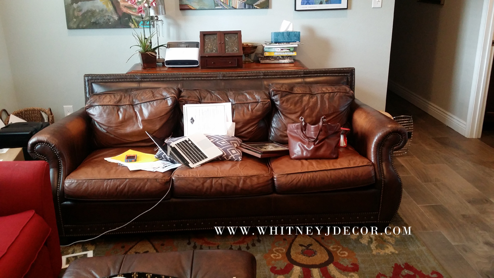
Her and her husband moved into the home with different furniture from the two homes they’ve just moved from, so there’s lots of mix-match furniture that we need to get rid of.
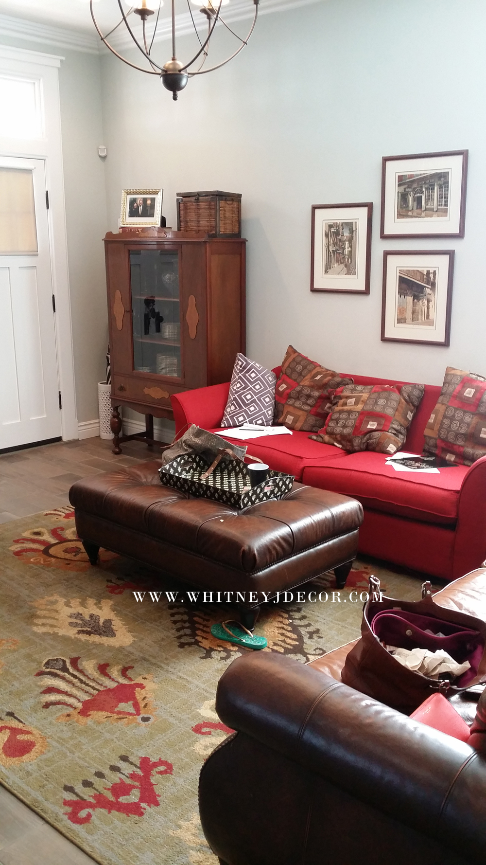
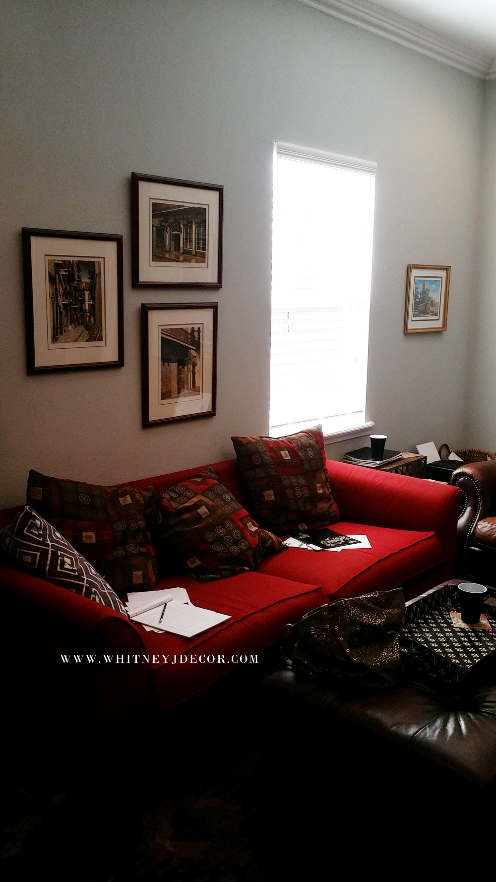
The room is pretty small, with only one living room that has to comfortably seat two adults and their two teenagers. Since this is the only common area (besides the connecting kitchen), we need lots of seating and storage.
At first glance, the room looks really small. My client was frustrated with the lack of space and how to successfully place her furniture.
One of the requirements that my client had was for lots of extra storage and a large sectional. She also really loves leather, so she wanted it to be on my top list of fabric choices. Her home was already painted with a beautiful shade of gray, so new paint isn’t needed. The paint color is already perfect and makes the room feel really bright. The floors are new, too.
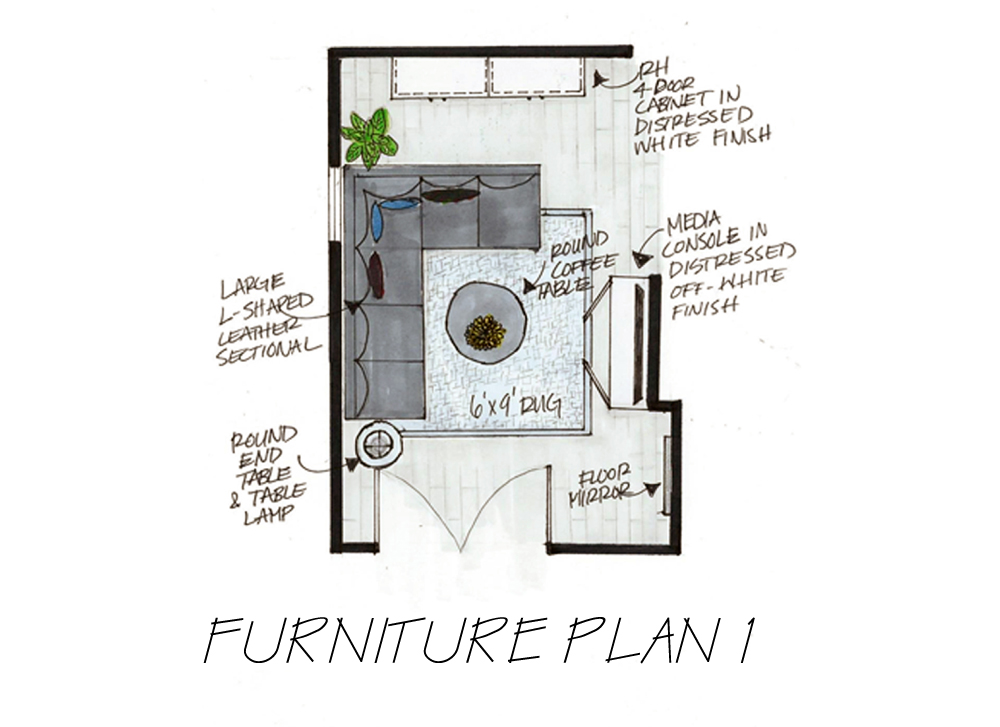
I took measurements, plugged it all into my AutoCAD program to brainstorm different furniture layouts. I needed to see the measurements on paper (in this case, on my laptop) to make sure a large sectional would work in such a narrow room. I came up with two design options for her.
Option 1 has a color scheme of creams, grays, and shades of blue. I specified a Restoration Hardware cabinet and other pieces of furniture that would look great in her living room. The cabinet provides much needed closed storage for hiding paperwork, electronics, and anything else. This Ballard Designs coffee table is probably one of my favorite coffee tables and I knew I would work it into her design plan as soon as I walked into her living room. The media center is the perfect piece to sit under her TV on the current wall that it’s on. The lamp from Pier 1 is also one of my favorite lamps. I think I’m buying a set for my own bedroom.
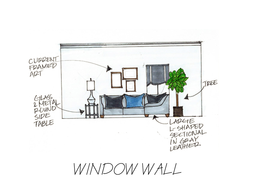
Depending on the design package my clients’ choose, I can create a few hand-drawn renderings for them to “visualize” how the space could look. As you can see in this sketch, the room is a lot less cluttered, since the two sofas and other large furniture pieces are gone.
In this view (below), it looks quite sophisticated. She mentioned to me that she wanted a very large tree, and in this option, we’d be able to fit one.
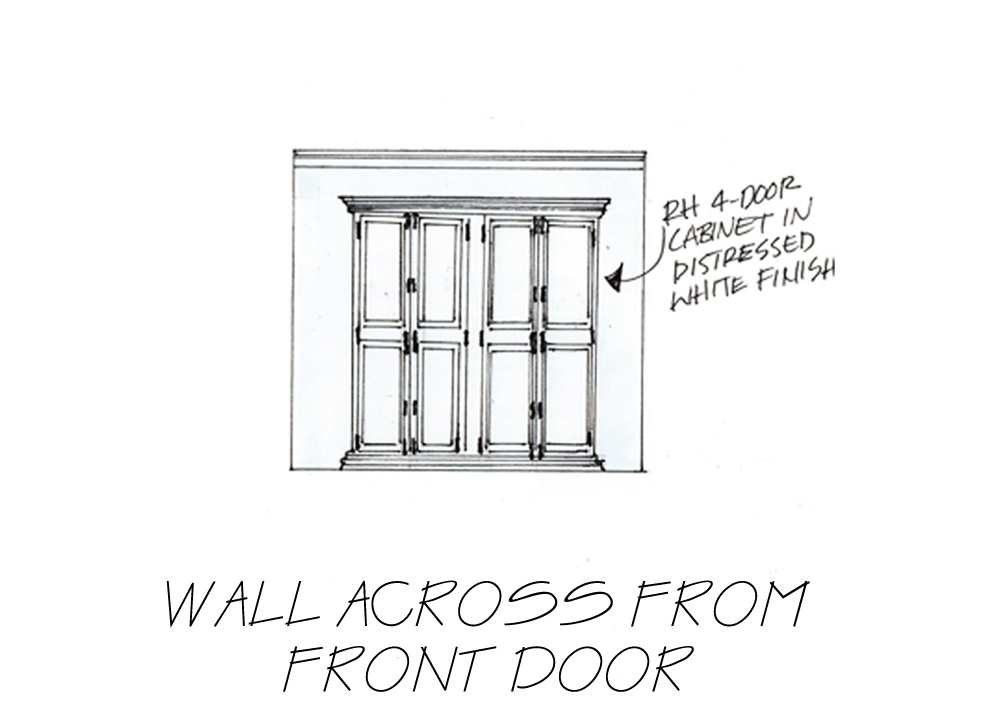
This RH cabinet is beautiful. Another one of my clients have a very similar one in her dining room. I chose this one, because it has classic, interesting lines and it’ll provide lots of hidden storage.
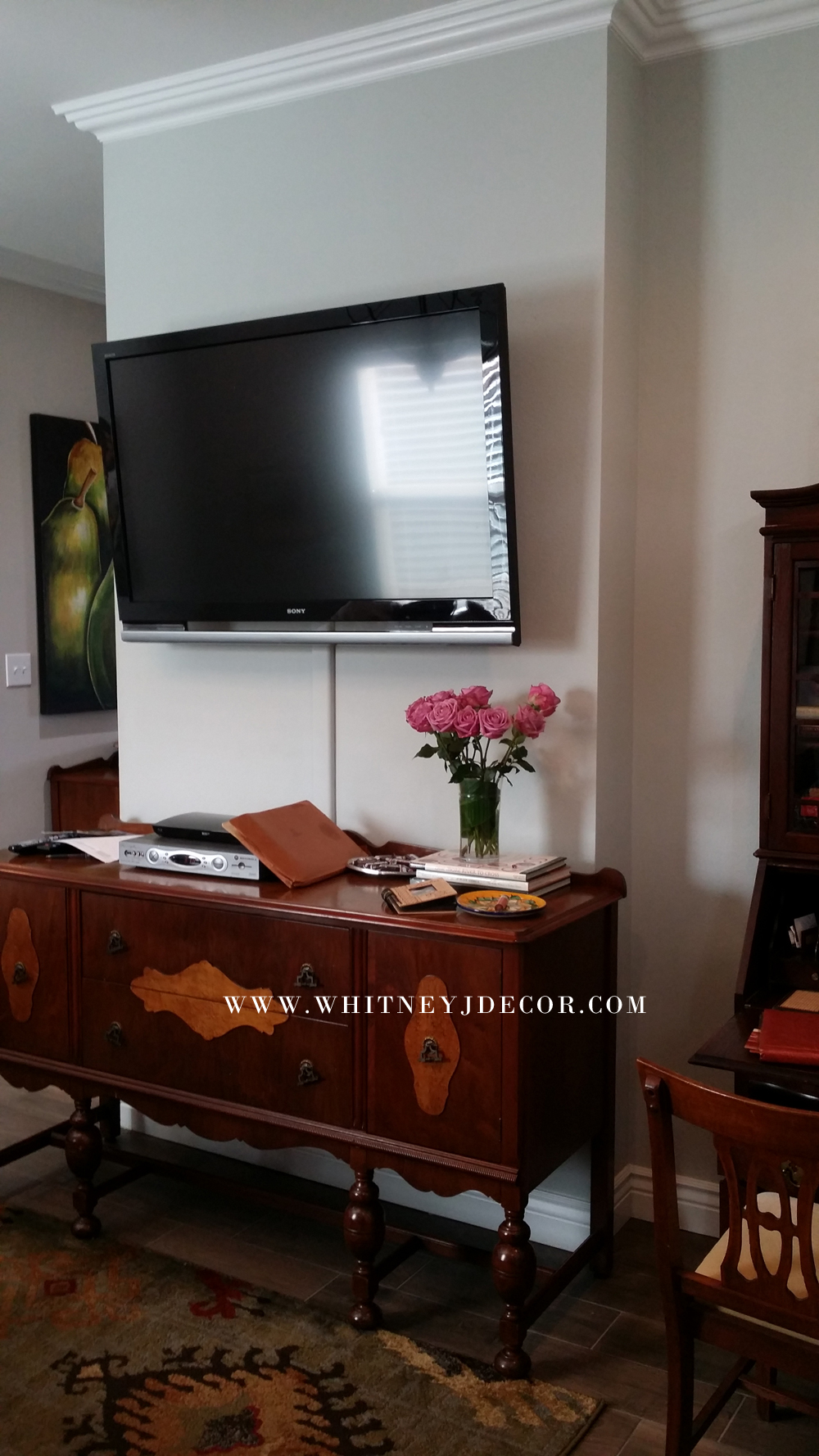
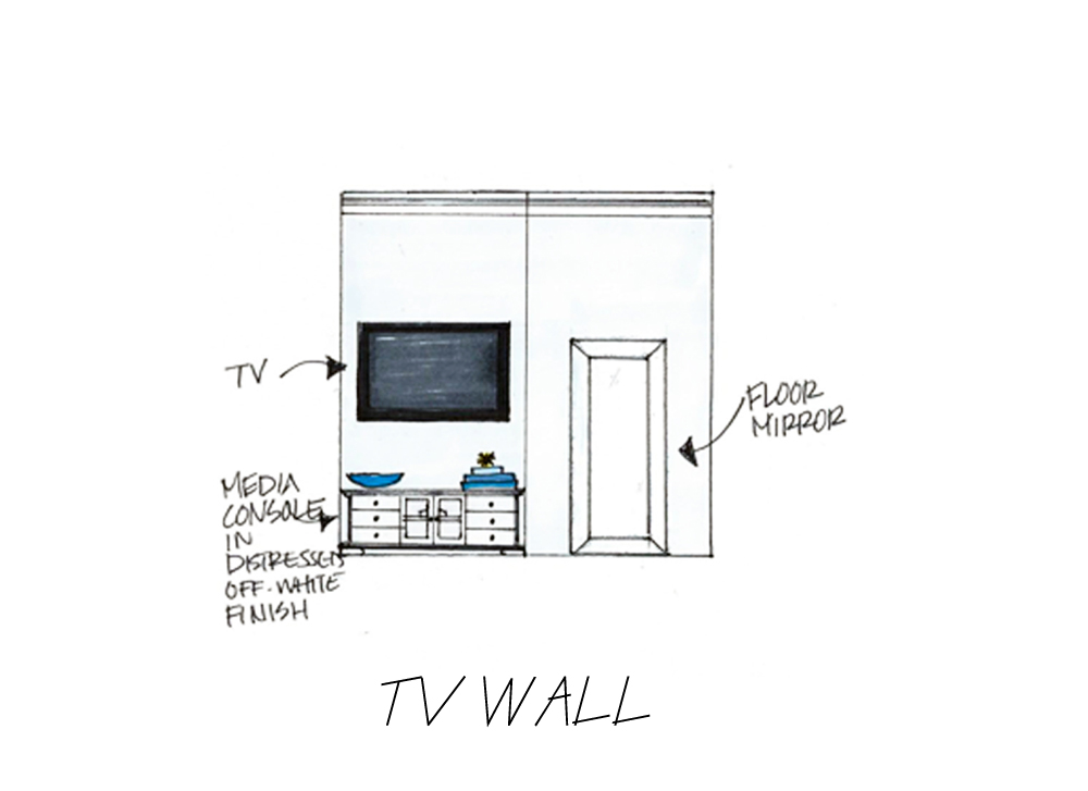
As I mentioned before, this option keeps the TV on the current wall that it’s on. To me, a big problem was the really large dresser-like console that sat under the TV. It was too deep and tall and just felt completely out of scale with the room. So, I found this one from Ballard Designs and knew it would be perfect. It’s just a couple of inches shorter in width, but fits perfectly on this short wall. It’s not as tall as the current console and less deep, but still provides a good amount of storage space.
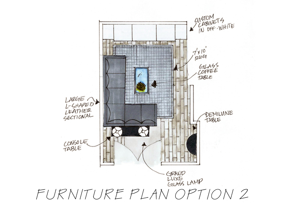
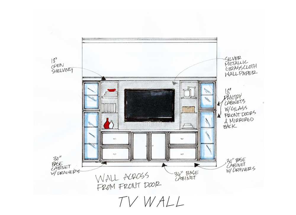
Option 2 has a mostly black and white color scheme with gray rug and red accents. With this option, we move the TV from the wall it’s currently on, and place it on a large wall surrounded by a custom built-in cabinet.
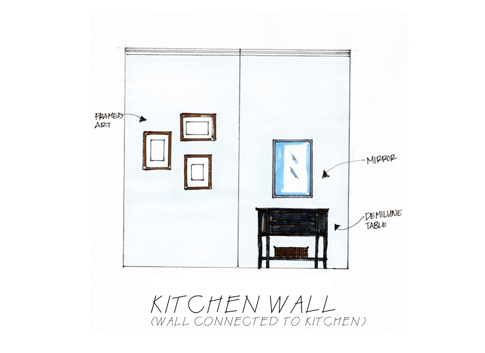
With this layout, the TV is moved to the wall across from the front door. Because the built-in is massive, there will be lots of storage. I especially wanted this layout to break up the space between the front door and the “living area”, because neither of us liked the fact that the front door opened into the living room. So, I created a sort of “entry” with a demilune table in the corner and a console table behind the sectional. This visually separates the room into two different areas. I call this “zoning”. You can learn more about space planning and creating separate zones in my space planning guide. Get it FREE by signing up to my email list.
I sell these black and white leopard print pillows in my Etsy shop and since I thought the fabric would be a perfect option for this layout, I specified using it for a custom roman shade for my client’s living room. I am a custom window treatment fanatic, because you can’t beat the professionalism (when done right) and the custom touch. I also specified a leather cornice to go above the window. Very unconventional, but so very cool!
This is the first custom built-in that I’ve designed (other than in design school), so I knew I wanted to make it fabulous! It features both open and closed storage, with some glass doors, too. The entire unit would be in a soft shade of white, but the insides will be covered in a silver metallic, grass cloth wallpaper. So scrumptious!!
My client was thrilled with the options I’ve given her and now she has to think about how she wants to move forward. If you’d like me to come up with design boards and layouts for your home, check out my services page or sign up for my decorating course, so I can help you through your own decorating project.
If you were my client, would you choose Option 1 or Option 2? Leave me a comment and let me know!
Till next time,







Both are so lovely!! I LOVE the custom built ins but I’m not a fan of the layout of the room with them, so I think I’d opt for option 1. When I have a house to decorate, I know who to call! #BLMGirl
Yep, I’m your girl!!
Hey! I love your blog. Option 2 is my favorite. I like the black and red 🙂 you’re talented
Miyaloves.com
Thanks so much, Shamiya! I love option 2, too!