As a designer, I get the most requests to help clients choose paint colors for their walls. As I mention all the time, paint can be the biggest updates you can make in your home and has the greatest impact. If you can’t afford to hire a designer, it can be really hard to choose your paint colors from scratch. So, today I’m going to make it easy for you.
But, first, let me mention that before you commit to any paint colors, you should purchase paint samples and paint large swatches on the walls. I like to paint at least a 1 foot square sample on the walls of a room. (Sometimes I paint the sample on ALL walls on the room.)
Make sure you live with your paint samples on the wall for a few days and view the samples in the morning, afternoon, and at night. You need to view them with the lights both on and off each time of day, so you’ll get a view of what the paint color will look like.
Although painting can be inexpensive (compared to other construction and/or decorative updates), it can take a lot of time to complete, so you want to make sure you get it right the first time. This is why living with your samples for a few days is really important.
I love to choose colors from a decorative element (like art, rug, curtains), a gorgeous photo, or paint palette from a store like Home Depot or Lowes.
Art, Rug, or Curtains
This is my favorite way to choose paint colors. I like to start with art that I’m really drawn to and pull colors from it. I start with art when beginning many of my decorating projects. This is what I did with my cow canvas art in my living room. Once I found the art, I decorated my room around it.
For this example, I used the Benjamin Moore color picker app to pull a paint palette from the art below, but you could bring your art (or other item you’re using as color inspiration: rug, drapes, fabric, etc.) to a paint store and match paint swatches to it.
As I’ve said before, when you’ve found the paint colors that you think you love, paint a few samples on the walls in each room that the color is going in. And, live with the colors for a few days. It’s important to see the paint on the walls at different times of day with different light.
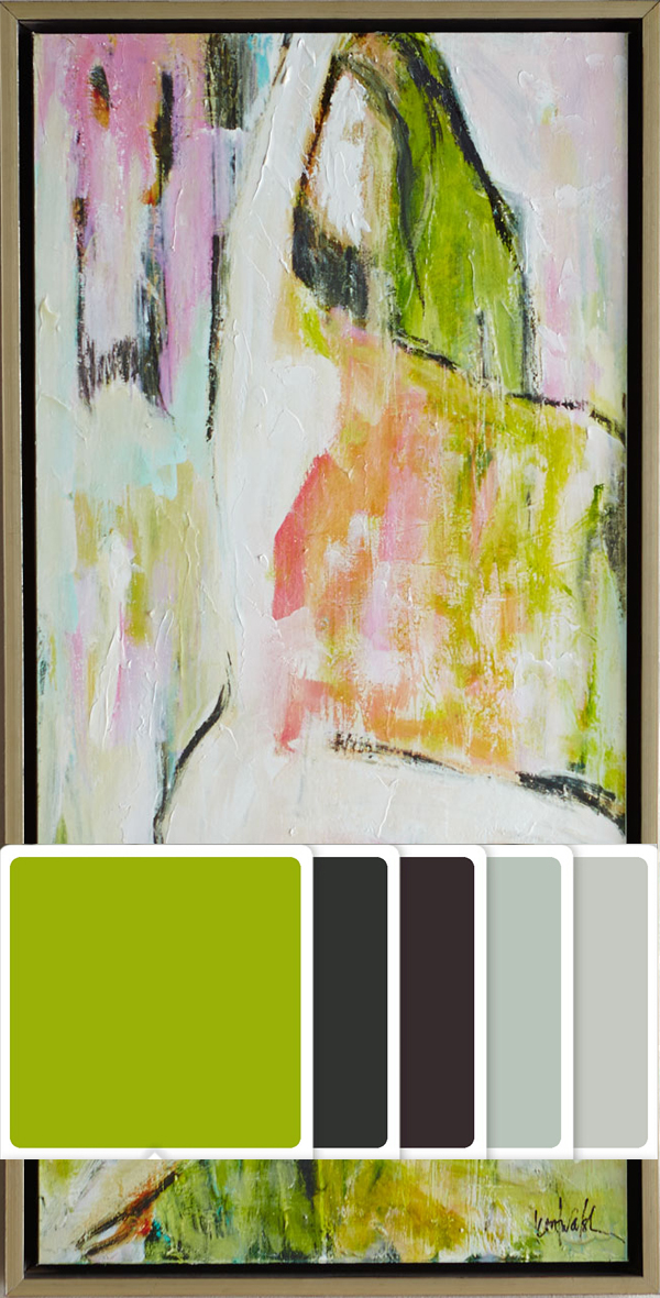
The five colors that the Benjamin Moore app pulled from the the art above are all great colors. I personally would have done the lighter colors on the wall, but paint palettes like these can be used for your entire room’s color scheme and not just for the paint colors. I would use one of the darker colors as color inspiration for my upholstered furniture and brought in pops of the lime green. Even though the app didn’t pull out the pink from the art, I would use that color in my color scheme, too, because you see how well these colors work together in the art.
Gorgeous Scenery, Landscape Photo, or Fashion Shoot
If you visit a place, go on vacation, or find a photo from a cool photoshoot that has a gorgeous color scheme, use that image as inspiration for your paint colors. You can choose 1, 2, or all colors in the image as your color inspiration. Don’t be too worried about if the colors “go together”. They go great together in the art, so they’ll go great together as your home’s color scheme.
[Tweet “If colors look great together in your favorite art, use them as your home’s color scheme.”]

I love this photo from National Geographic taken at the Mambukal Mudpack Festival in the Phillipines. Participants cover themselves with Mambukal clay and celebrate the harmony of man and nature. The reddish-orange color of the clay is beautiful. Picture this color on the walls in an entryway with this photo blown up and mounted in a large frame. Both the bold color and photo (used as art) would make a huge impact and be a great conversation starter. Sprinkle in black and white (maybe in the form of b&w framed photography) and some green (plants?) and you have a complete color scheme. Your entryway would be AMAZING! Then, in the rooms that connect, you can tone down the wall colors with a white paint or go darker with the brown or charcoal colors. Then, sprinkle in the color of the clay as more art, pillows, or other accessories. You always want to connect rooms by repeating color.
Just make sure you purchase the right to use any photos you find online. Don’t just download a photo and print it to use in your home. That’s really illegal. Some of my favorite places to go for photography is Etsy, Art.com, and AllPosters.
Paint Palette from Paint Store
This is probably the easiest way to go. Most paint stores have booklets with color palettes. If you find one that you’re interested in, don’t just purchase the colors that are suggested – get paint samples and paint them on your walls before committing to them.

These paint palettes can take the headache out of picking paint colors, but their usually created by designers that know a thing or two about color. So, you can expect these colors to work well together. But, again, you need to test these in your home before committing to them or purchasing entire gallons of paint.
With these 3 ways to choose color, you’ll become more confident in choosing your paint colors. I do this all the time, trust me. I still use my handy fan decks when doing color consultations, because they are great when I’m choosing a color scheme from scratch. I pride myself on my use of color and being able to pull 4-5 colors from my fan decks that would look great in a client’s home.
But, when I meet a client that has a hard time committing to a color or just has a hard time figuring out what color to start with, I always help them find art or a photo that could serve as color inspiration.
So, I’d love to know… what fail-proof ways do you choose paint colors? Did you find these tips useful? Let me know in the comments below.
Till next time,


Great tips, Whitney! In the past I used to see a color I loved online, then head out a buy a gallon of paint. Once I got in on the walls it would read so differently. I’m much wiser now and always spend a few dollars on the samples first. LOL!
Yes, Brandi!! I love using unconventional ways to be inspired by color, but sometimes those colors won’t work in our spaces. It’s so much easier to just buy those samples first.
Great post Whitney! I always like to key color schemes off a favorite piece of art, rug or fabric.
Thanks so much, Terri!! That means so much coming from you, because you’re a color PRO!
I think that designing a room around a certain painting is a great idea. If you really like the colors in a piece of art, chances are you’ll like the colors for your whole wall. Plus, choosing a paint color based on an art piece will connect the room and make it seem like one whole piece, not just an assortment of different designs. Thanks for the suggestions!
This summer, I’m going to be repainting my living room. I like the idea of basing your colors off of a piece of art, so perhaps I can find a good painting do make this happen. I feel a lot more confident in picking a paint color now, thank you so much!
I agree that before you try to pick any one color that you get paint swatches and check out how they would actually look on a wall. Colors don’t look the same on paper as they do on a wall, they are also affected by different colored things that are around your room. See how it will actually compare to each of these things.
Awesome post! I think it is so smart to have a color scheme and I especially love the idea of using a frame or portrait to guide a color pattern! Thanks so much for sharing!
These are great tips! I’ve found paint color inspiration from pieces of art multiple times.
It’s such a fun and easy way to choose colors.
I appreciate your post 🙂 thanks for sharing such a informative information. I especially love the idea of using a frame or portrait to guide a color pattern!
Thank you for this incredibly helpful post! As someone who’s always struggled with choosing the right paint colors, your insights are like a breath of fresh air. I love how you emphasize the importance of living with paint samples on the wall for a few days and viewing them in different lighting conditions. The idea of using art, rugs, or curtains as a starting point for color inspiration is brilliant.